
Role
Prototyping
Visual Design
Interaction Design
Team
Horizontal Consumer and Search Team
Tools
HTML/JS/CSS/Flask
Sketch
Figma
Protopie
Timeline
June-August 2021
- My Role: Prototyping, Visual Design, Interaction Design
- Tools: HTML/CSS/JS, Sketch, Figma, Protopie
- Timeline: June-August 2021
Introduction
My Experience
During my 9-week internship at Verizon Media (Yahoo!) as a Product Design Intern, I worked on various projects for Yahoo Home, Yahoo News, and Yahoo’s Design System. Since most of these projects are close to public release/shipment, I want to share a high-level overview of my learnings and takeaways. Overall, I dived into four different areas of design during my internship: prototyping, UX research, visual design, and interaction design.
Prototyping
Interactive Prototypes 👩🏻💻
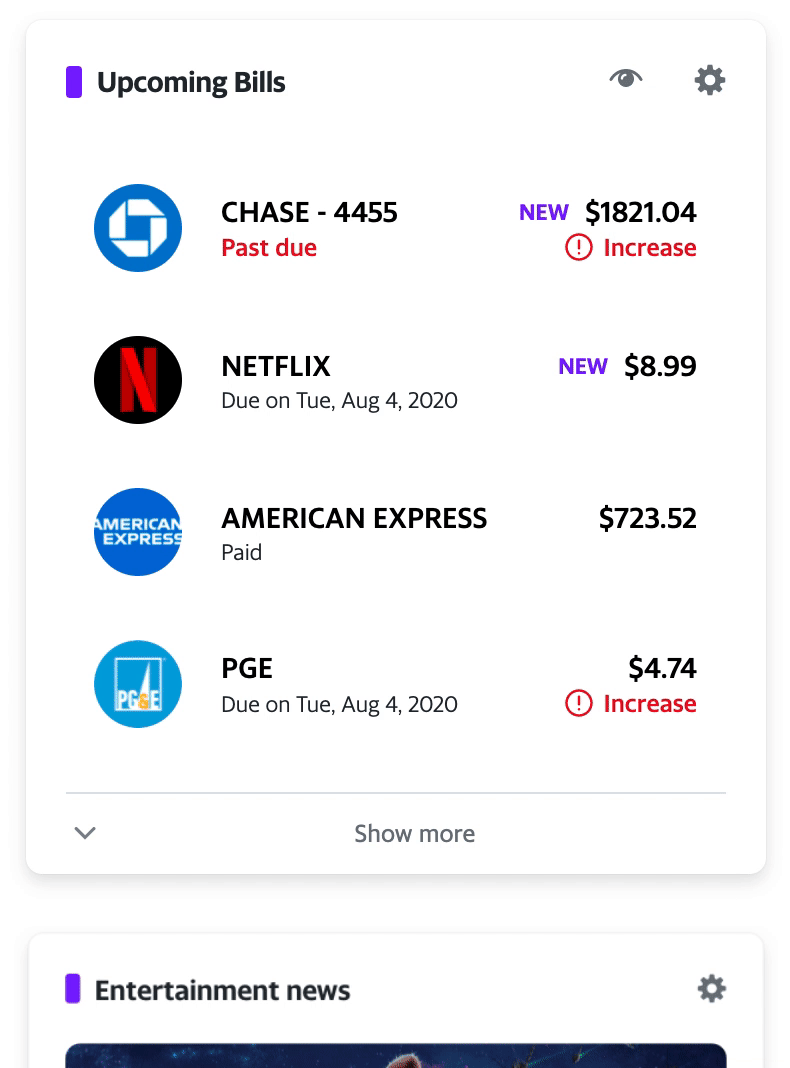
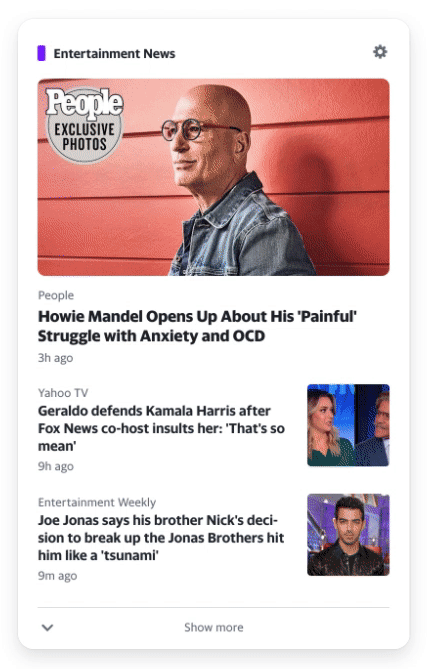
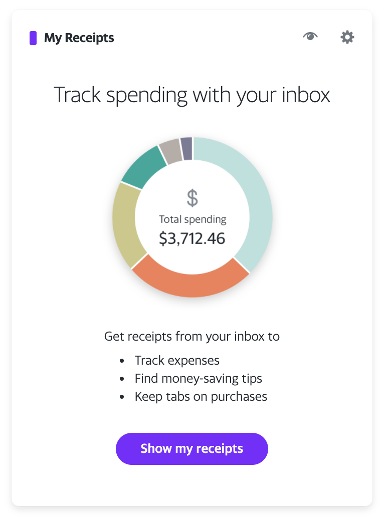
During the first weeks of my internship, I worked as a design prototyper, assisting different teams with prototyping, designing solutions, and iterating on mockups. As a designer and developer hybrid, I worked with the Yahoo Home design team to create high-fidelity, coded prototypes that housed different flows, interactions, and states. Two of the design prototyping projects I worked on were:
- Yahoo Home Personal Finance Prototype, with Ellen Kim (Designer) and Andy Jin (UX Researcher)
- Yahoo Home Module Picker, with Bryan Farevaag (Designer) and Tyson Gushiken (Designer/Mentor)
Both of these prototypes and their features are in production. With these high-fidelity prototypes, I was often given mockups via Sketch and InVision. I then coded high-fidelity interfaces and flows while providing my own design feedback and, most importantly, expressing my creative freedom on small micro-interactions and animation. My prototyping process:

Sketch
1. Ideate & Design
I'm sent Sketch files from designers and am debriefed about the main design and/or research goals.
Sketch, Zeplin
2. Inspect
I either use the Sketch “Inspect” tool and extract key attributes like size, shadow, etc. or get assistance from uploaded files on Zeplin.
visual studio code, atom
3. Code/Iterate Away
I visualize the layout of the design, translate everything into HTML/JS/CSS/Flask, and add some motion-design-magic ✨
As I did my design-to-website translations, I would also collaborate with the designer I was working with by suggesting alternatives to components or interactions, discussing other design decisions, and iterating based on feedback.
Overall Prototyping Takeaways
Complex and interactive prototypes
With coded prototypes, you can house various flows and states. For example, one of the coded prototypes showed empty and preview states while dynamically changing “dummy-data” based on user interaction. Users could also interact with different modals depending on the scenario—all in one prototype.
Smooth interactions and animation
While I’m a big fan of Figma and InVision, some prototyping tools lack flexibility or buttery transitions. With coded prototypes, I could customize animations and motion to my liking while taking into account when they could be triggered based on user journeys. Engineers could also inspect my code to understand the animation side better.
High-fidelity prototypes and deliverables
High-fidelity prototypes that are literally the real deal, minus the back-end-data-jazz. When users interact with it, it feels as if it’s the actual website. These prototypes are super helpful for design discussions, user testing, and engineering handoff.
UX Research
Beyond usability 💬
During my internship, I worked with Andy Jin on Yahoo's UXR Team to put the Personal Finance prototype I coded through moderated testing. It was amazing to see the power of high-fidelity prototypes.
Overall UX Research Takeaways
-
Expose pain points in designs. Usability testing. You know the drill.
We were able to test what flows felt intuitive to users while uncovering design components and steps that prompted the most confusion. -
Listening to users' thoughts and first impressions in the moment.
While usability testing is valuable, having users interact with our prototypes and conversing with them allows us to understand their needs, concerns, and wants.For example, one user professed their uneasiness due to privacy concerns and data breaches while interacting with the personal finance prototype. This prompted the team to brainstorm design solutions to make users feel more safe and secure with our product.
-
Building empathy with users, seeing how excited they are for certain features (one of the reasons I love working with B2C companies).
One of my favorite takeaways from UXR was seeing how users were excited for certain features we were testing out. Hearing “oh my gosh, I can’t wait to use this!” or “oh wow, I was needing this. This is going to be great!” put a smile on my face.
Visual Design
Yahoo's Design System 📖
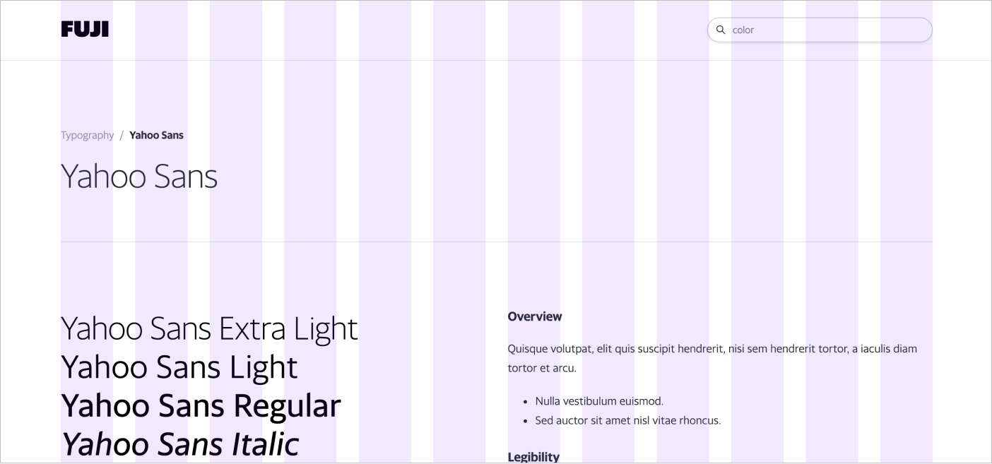
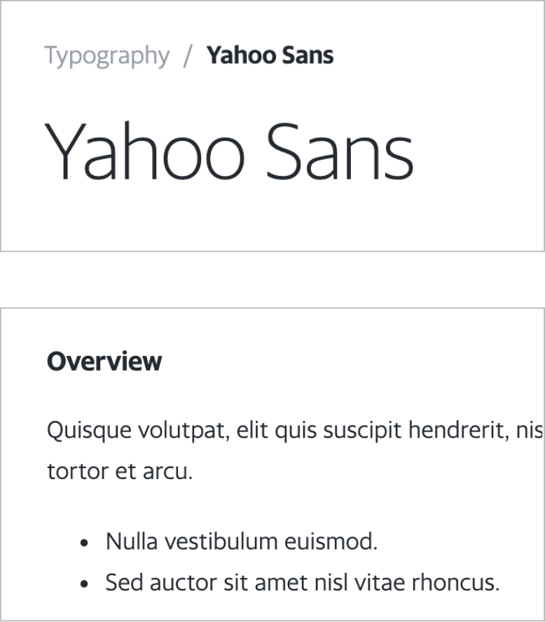
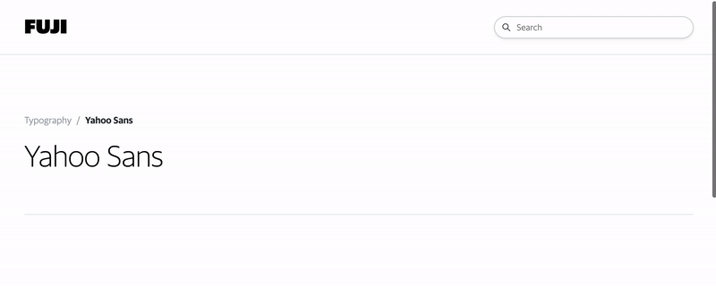
As my last project, I worked with my mentor (Tyson Gushiken) to find a way to standardize documentation for Yahoo’s design system—the single source of truth.
This project consisted of two parts. First, designing a Figma template to enforce a consistent, standarized format for all design documentation. I also brainstormed ways to take advantage of Figma’s component feature to make it easier for designers to input new documentation for the main website. Secondly, creating a sample website to prototype different features such as a search feature.
12-column grid layout for wider content view and responsive layout
Reformat visual hierarchy
With this project, I worked on the visual layout of the documentation website and interactions with various components on the page, from a hovering drawer to a dynamic content nav.
Breadcrumb
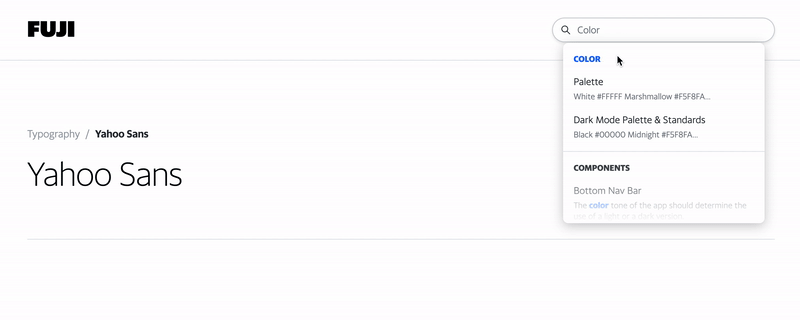
Search
Navigation
WHY: This enforces recognition over recall, thus minimizing the reader's memory load and allowing users to quickly get to a specific topic on a page (which is especially useful for longer pages). Lastly, it allows users to understand where they are within the structure of main and subpages, as well as explore related content farther up the tree.
WHY: The main audience consists of Yahoo designers and engineers. In most cases, employees are doing known-item seeking. The search bar allows employees to get to their target documentation as quickly as possible, without having to scrub the nav.
WHY: Implementing a hoverable side navigation to give room for the wider, 12-column grid layout.
Interaction Design
Swipe, swipe away 👆
During my internship, I worked with Lucia Chen (Designer), Ryan McCullah and Tyson Gushiken (Creative Direction) on swipe interactions for Yahoo News and prototyped various versions via Protopie. For this project, I iterated on the motion of UI elements to balance both user delight and utility. On each iteration, I collaborated with design leadership to hone the swipe interaction with meaningful and natural animations.
Project Introduction
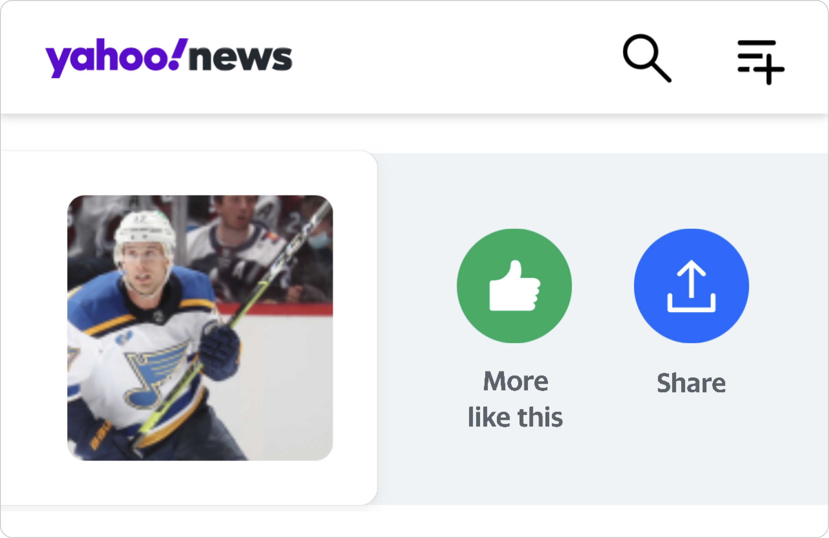
I was asked to prototype a swipe interaction for Yahoo article components, in which users could swipe left or right on a component to reveal actions such as seeing more of a post, sharing it, and so on. Ideally, this interaction could be universal to many Yahoo products.
Different article components via Yahoo News
At the start of the project, I was given a sketch file with specific dimensions for the swipe interaction. For example, when the user swipes 42px to the right, the first revealed action would be 30px, and so on.
A preview of the first Sketch mockup I was sent.
Iterations
After translating the static mocks to an interactive prototype, we realized that we had a long way to go with the interaction. There was a lot of movement going on: the “See less like this” text appearing as the user swiped, in addition to moving and growing buttons. We felt like the interaction had too many moving components, which can potentially disorient or overwhelm the user.
With this in mind, I went through the first iteration:

Static position
Keep the location of the button consistent, but have buttons grow as the user swiped to map the actions to the user’s swipe.
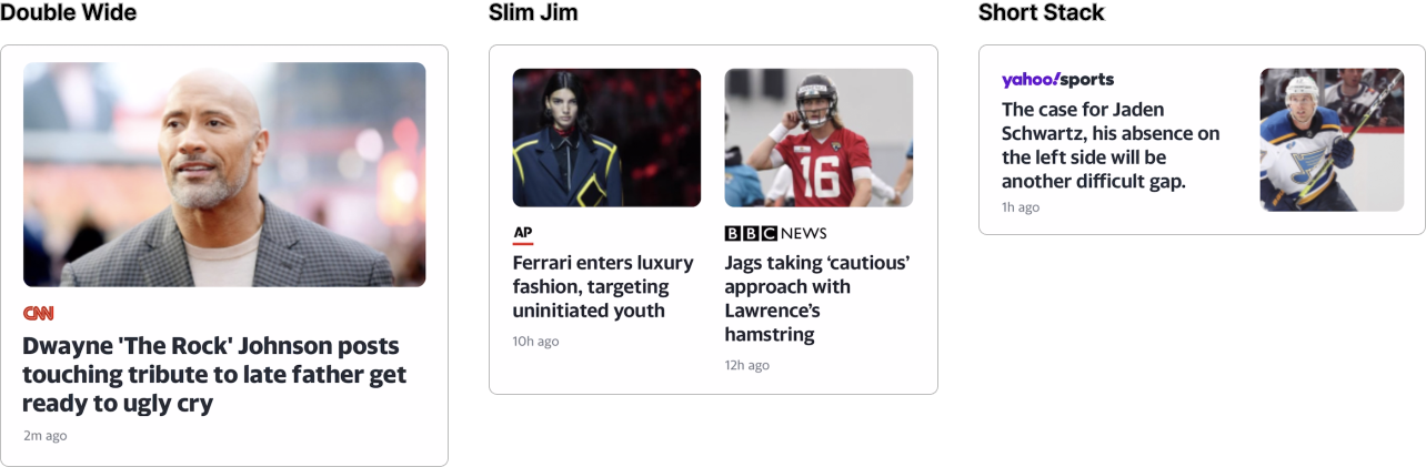
While this worked fine for the short stack components, the interaction became increasingly complicated when it came to “Slim Jims,” where there are two longer stories adjacent to each other.
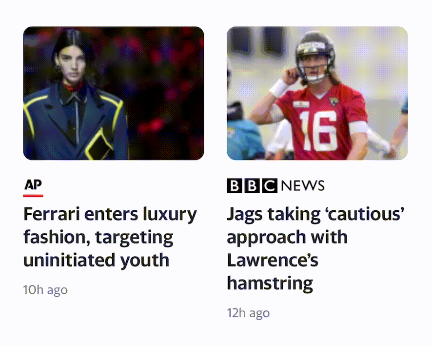
Swiping the left Slim Jim.
Because the Slim Jims overlap on swipe, the swiped card and associated buttons become blurred. For example: when the left Slim Jim is swiped, the Slim Jim on the right disappears. Users could either associate the revealed actions to:
- The left Slim Jim, because that is the card they swiped, or
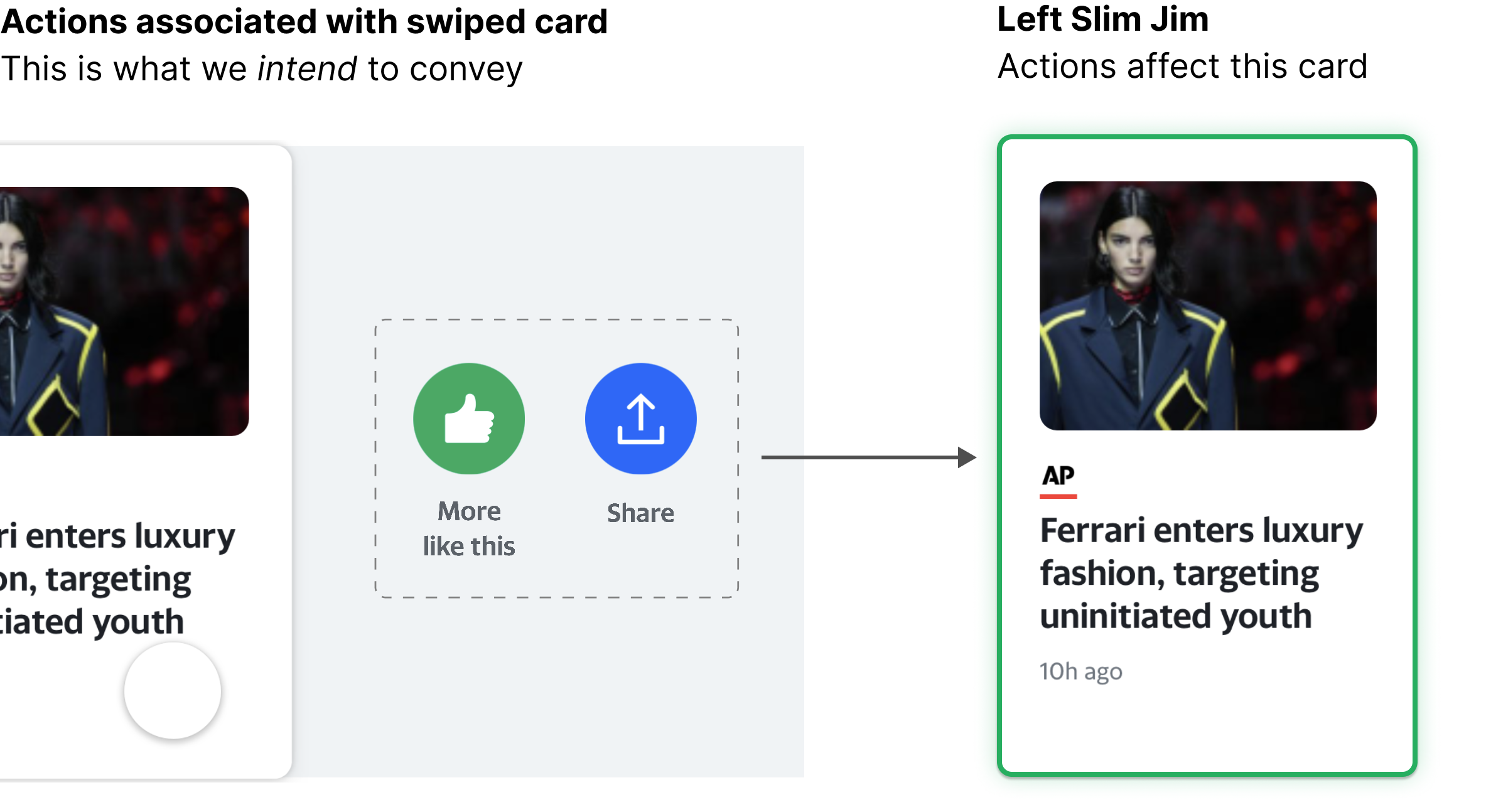
- The right Slim Jim, because the revealed actions took the place of the disappeared card.
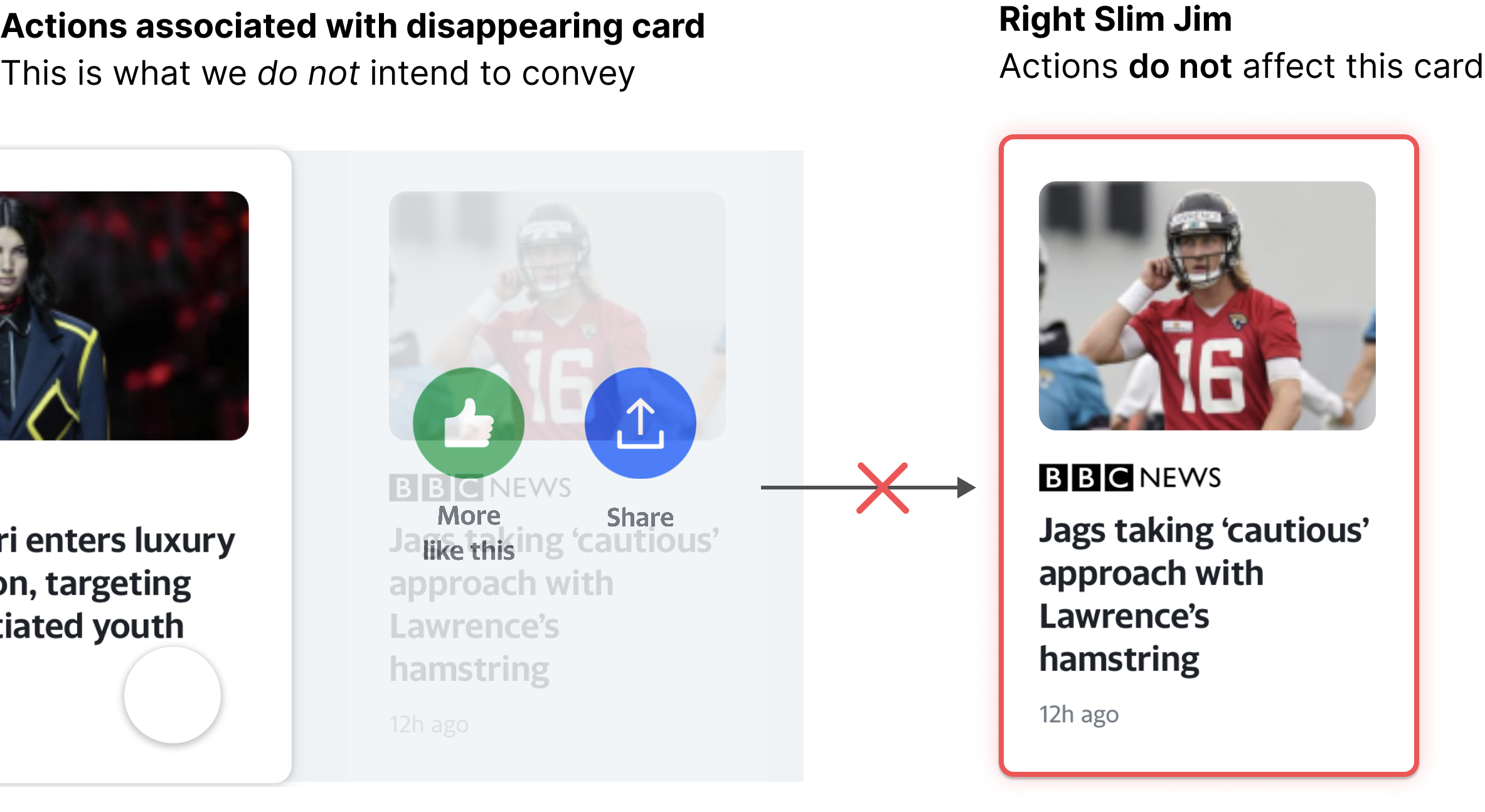
Confusing, huh.
Consequently, I had to brainstorm an interaction that would be both delightful and intuitive for all article dimensions: short stack, Slim Jims, and wide components. After brainstorming and seeking advice from various designers, I came across the second iteration:
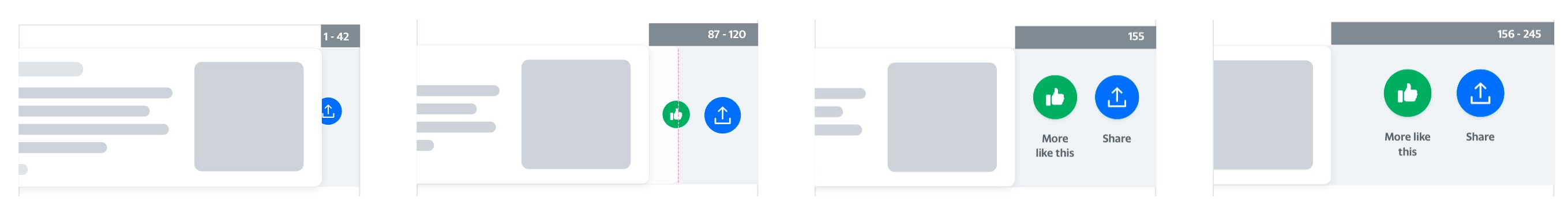
Snap to center
Have buttons follow the user’s swipe, and recenter on release.
The buttons follow the card the user swipes on. This further reinforces the relationship between the swiped card and the actions associated with that card. I removed the button scale from the previous interaction to reduce the overall movement of the interaction so that it wasn’t too overwhelming. Lastly, the buttons snap into center position once the user releases the card for consistency and ease of use.
Delightful
Lastly, I wanted to create a more delightful and smooth experience by having the disappearing Slim Jim scale and fade. This adds more dimemsion to the interaction.
Discoverable
Because this swipe interaction does not have any explicit signifiers, I decided to incorperate onboarding tooltips. I made sure that this format matched an existing onboarding flow on the Yahoo News app.
Reflections
Overall takeaways
-
Feedback is a gift.
It took me a couple weeks to break out of my shell, and when I did, it was so worth it! I learned so much more after chatting with other designers and asking them for design feedback. The designers at Yahoo would always give me detailed rationales, which I really appreciated! -
Taking design to the next level and making it delightful.
I was so stuck on designing interfaces that I forgot about the complexity but benefits of animations. Through coding prototypes and working with JS animation libraries, I began to really appreciate the power of animation/motion design. -
Big big shout to Tyson Gushiken for being such an amazing mentor. He guided me throughout the 9-weeks and set me up with projects that I genuinely enjoyed working on. After meeting him, I felt validated in my skills as a UX engineer and designer. He showed me the various benefits of design prototyping and gave me so many tips and tricks along the way. Also big thank you to Nina Ristani for being the best manager I could've ever asked for!